AMFLX
A digital growth agency site built like the pitch itself, kinetic hero, scroll-driven services, a filterable work archive where every case card flips to reveal the thinking.
Visit amflix.vercel.app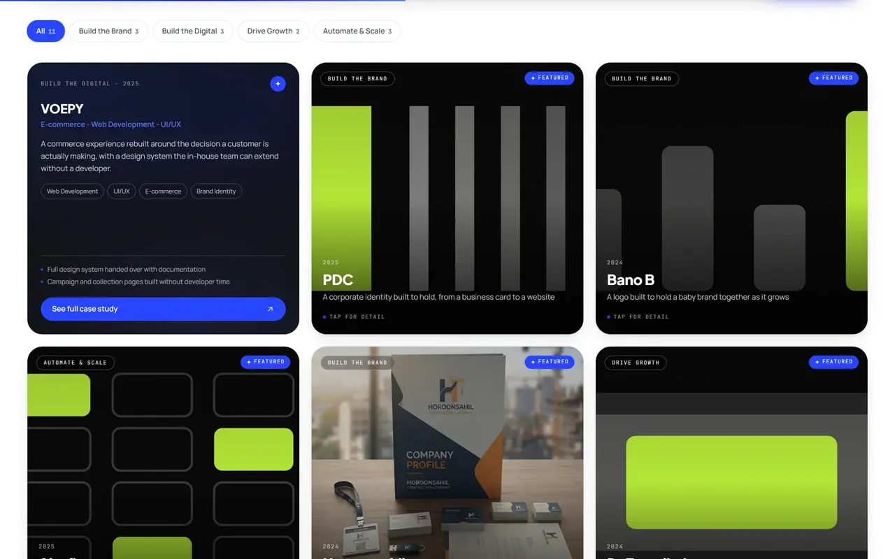
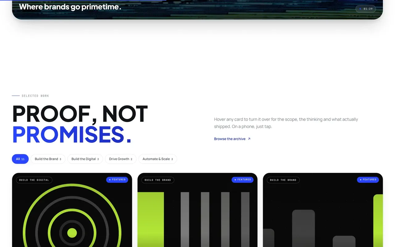
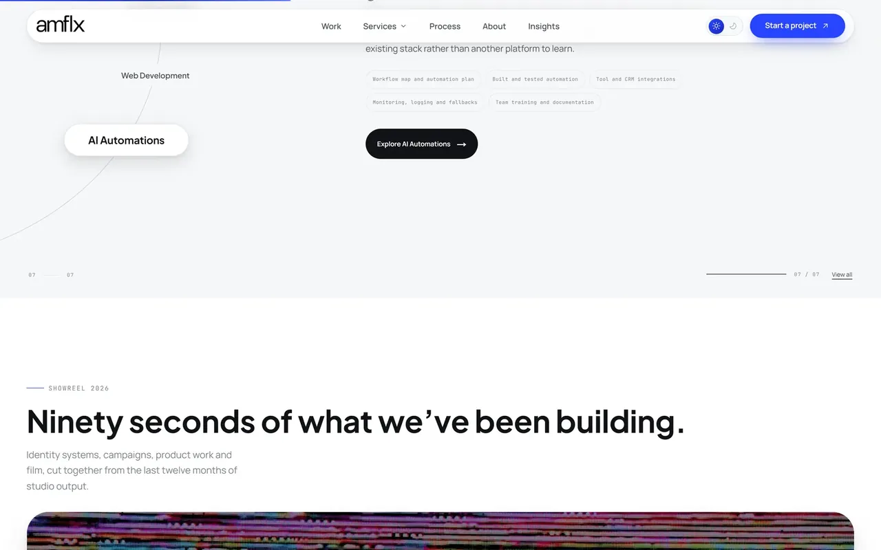
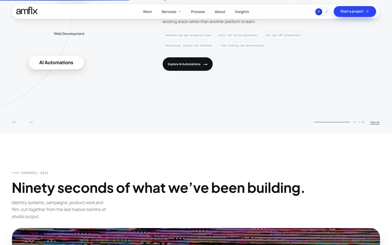
Recorded on the live site, the kinetic hero, the scroll-driven services pan, a case card flipping over, archive filters and the project-start form, with zooms on each interaction.
The problem
Agency sites all claim creativity and show the same five sections. AMFLX needed to prove range, branding to AI automation, without turning the homepage into a brochure wall.
What we built
An experience architected around proof: a rotating hero that cycles the disciplines, a scroll-driven services explorer across seven disciplines, an 11-project archive where cards physically flip to show scope and deliverables, and a 90-second showreel carrying the brand.
The result
A production agency site on Vercel: home, process, about, contact, insights, 12 service routes and a full case-study archive. Every service has a page, every project has a story.
The product journey
We grow brands, [word]
The hero rotates through the disciplines, Branding, Web Development, SEO, while a marquee ticker runs the full service list underneath.
Four outcomes, not a menu
Build the Brand / Build the Digital / Drive Growth / Automate & Scale, services framed as results, each expandable.
Scroll to explore
The services section pans horizontally through all seven disciplines, Identity, Demand, Motion, Craft, Product, Systems.
Ninety seconds of proof
The showreel plays the studio's output, identity, campaigns, product work and film, inline, with runtime stated up front.
Flip the evidence
Every work card turns over on hover (tap on mobile) to reveal the scope, tags, deliverables and a route into the full case study.
Start a project
A dedicated contact flow captures the brief, not a mailto link at the bottom of a page.
Best features
Flip-card case studies
Each project card physically turns over to show the scope, the thinking and what shipped, proof on the back, brand on the front.
A filterable work archive
Eleven case studies organised by outcome, Build the Brand, Build the Digital, Drive Growth, Automate & Scale, with live counts per filter.
Kinetic hero
The headline word cycles through disciplines while a service ticker runs the marquee, the agency's range stated in the first five seconds.
Scroll-driven services
Seven disciplines explored in a horizontal pan rather than an accordion, Identity through Systems, each with its own deliverables list.
Embedded showreel
A 90-second studio reel presented as a proper film card, runtime visible, so visitors know the ask before pressing play.
A real services architecture
Twelve routes across the disciplines, including AI-automation sub-services, so every capability gets its own page, copy and enquiry path.
How we handled the hard parts
- Flip that works without a mouse
- The card-flip interaction is hover on desktop and tap on mobile. The page copy tells visitors exactly that. No dead interaction on touch screens.
- Range without the wall
- Seven disciplines could have been a wall of text; instead they're a scroll-driven pan with one deliverables list per panel, depth without scroll fatigue.
- Proof organised by outcome
- Case studies are filtered by what the client bought, brand, digital, growth, automation, not by year or by logo grid.
- Every page earns its route
- Sub-services like CRM automation and PPC get their own pages rather than bullet points, each one a landing page a searcher can arrive on.
Stack
Frequently asked questions
Is this a template agency theme?
No, a bespoke Next.js build with custom interactions: card flips, scroll-driven sections, kinetic type and a filterable archive wired to real case content.
What's the flip-card interaction?
Hovering a work card rotates it to reveal the project's scope, service tags and deliverables, with a direct link to the full case study. On touch devices it flips on tap.
How is the work organised?
Eleven case studies filterable by outcome, Build the Brand, Build the Digital, Drive Growth, Automate & Scale, plus a full archive page.
Does the site have real content or lorem?
Real content: named projects with narratives (MediPath CRM, KindMatch, SendWave, VOEPY and more), actual service pages, and an insights section.
Can Usmani Labs build an agency site like this?
We built this one: interactive marketing sites with real case-study systems are our specialty. Tell us about your studio.
Keep exploring
- Web Development : Marketing sites, web applications and portals: fast, accessible and built to rank.
- UI/UX Design : Product design and interfaces users understand instantly.
- Branding : Identity, strategy and guidelines: a brand that scales.
- SEO : Technical SEO, content and audits that turn search into a channel.
- Northline Property & Build case study : A complete marketing site for a property & building company, five service disciplines, a project case-study system and a consultation funnel in one editorial package.
- Keynou case study : Free online file-conversion and document tool suite.
- Workflow automation for agencies : the same fixed-price, built-around-your-workflow approach for agencies.
- Software we build, by industry
Built by Usmani Labs
We turn manual business workflows into software that runs them: fixed price, shipped in weeks.